Kinwell Icons
In 2023, I started working with Kinwell, a company which specialises in ICT, business telephony, healthcare technology and security systems.
Kinwell is a family business founded in 1986 as Telecom Service Group. Its success story began in Willem and Henny Pastoor’s attic room in De Wilp. It was the early 1980s. The time of faxes, telephone exchanges, office automation and telecom pioneers.
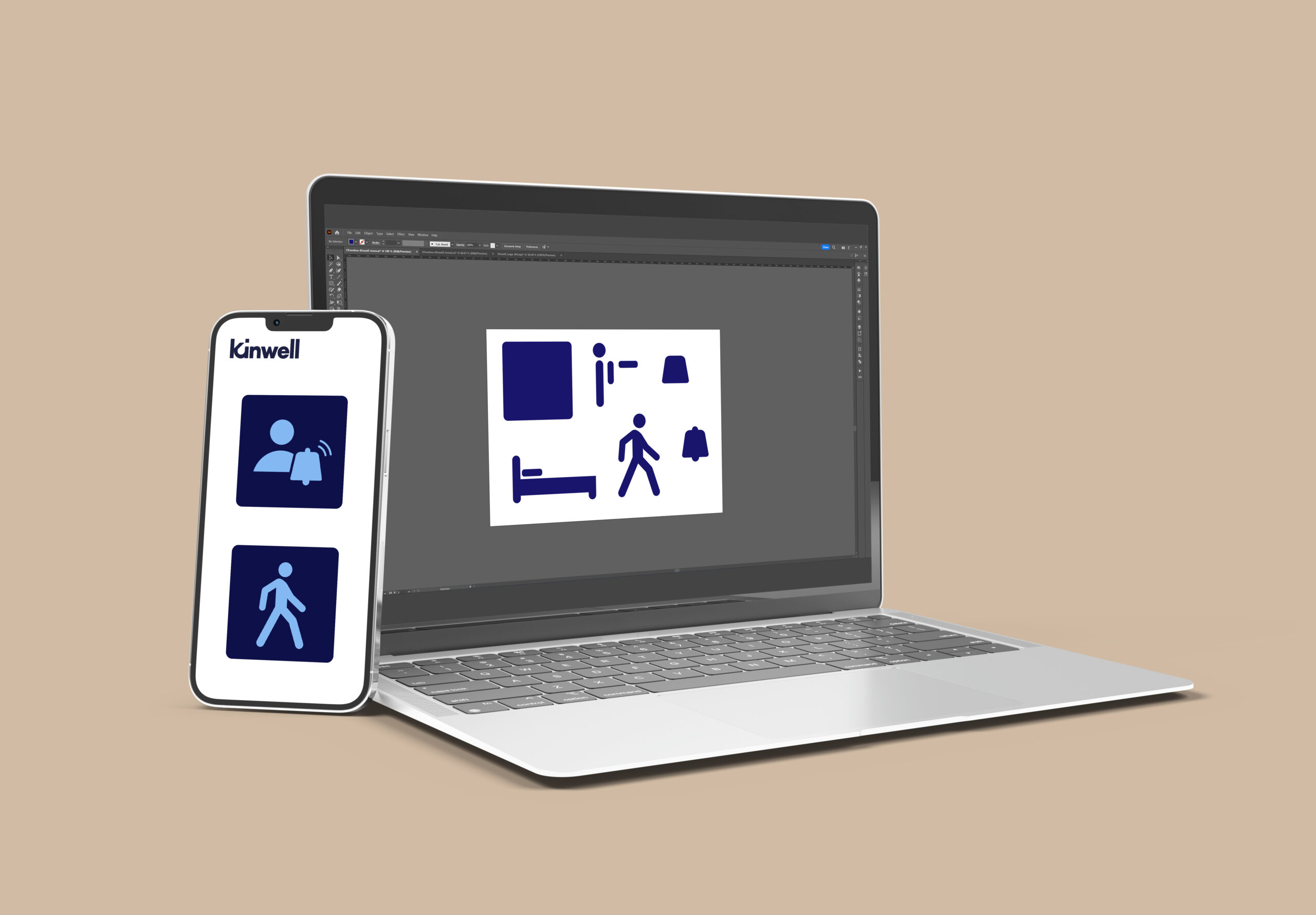
Since 2023, Kinwell, previously Telecom Service Groep, has switched to a brand new name and corporate identity, and that included new icons. I got in touch with one of the employees of this company and was asked to design these icons. Which seemed like a fun challenge to me.
Before I started designing, my contact gave me a file containing several examples of what kind of icons the company needed. I carefully analysed this file and also took a close look at the new logo, so that I could design the icons in rather the same style and so they would fit within the new corporate identity.
After reviewing the files provided by the company, I set to work on the first set of icons to suggest the style. Each icon is made up of separate shapes that I can use again for other icons, so I could work more essentially.
For the first proposal, I already received good feedback from Kinwell, which I was very pleased with myself. With specific requirements and the right feedback, I’m sure I’ll be able to continue making the whole icon pack.